Client
Thorned Studio
Sector
Branding, CGI Direction, Motion Guidelines
Industry
Consumer Electronics
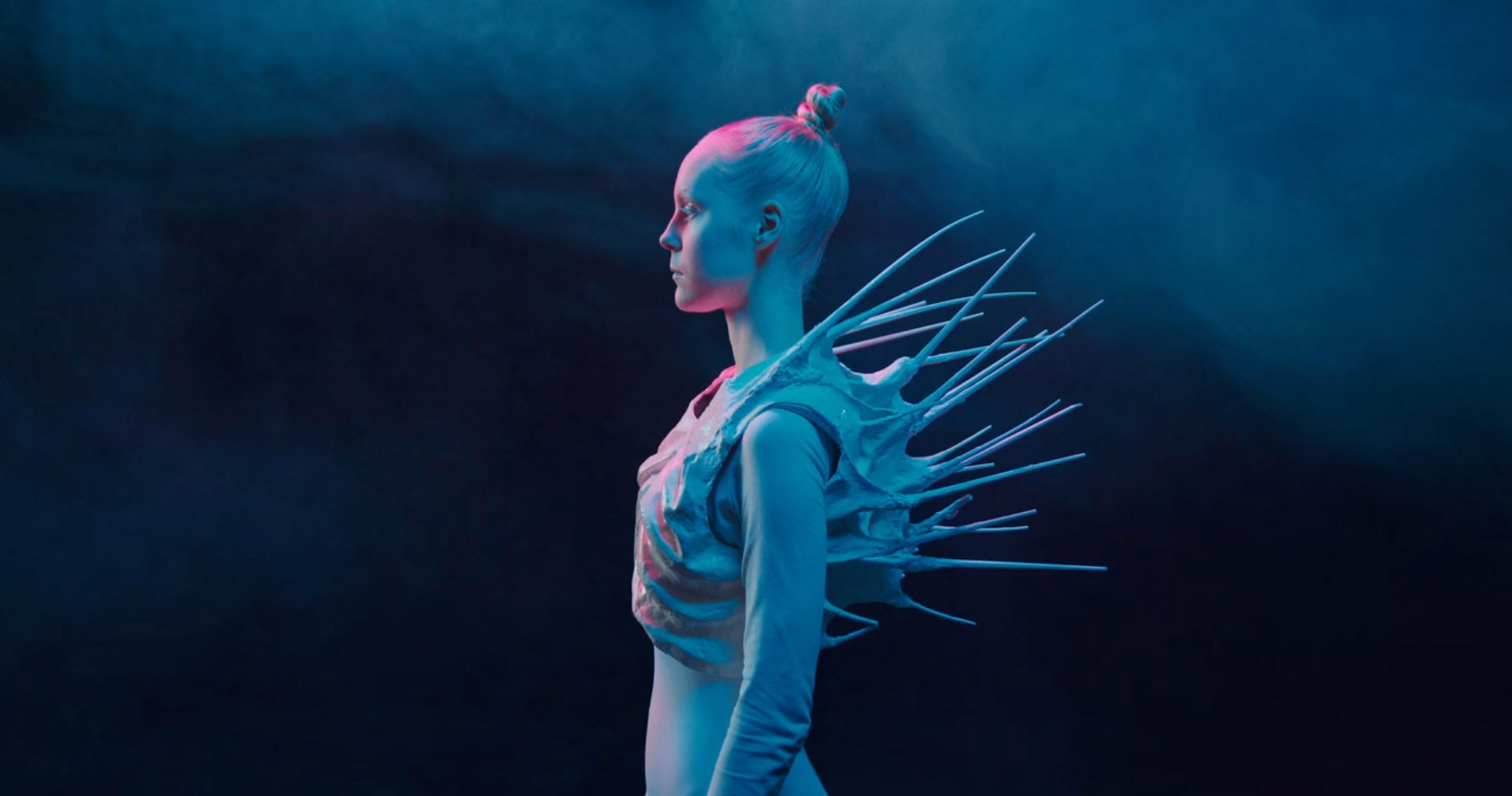
What does it mean to design for tension? For Thorned it meant holding two opposites at once, fragility and threat, softness and sharp edge, until the uneasy space between them became the brand itself and the only honest answer.
For Thorned it meant holding two opposites, until the space between them became the work.
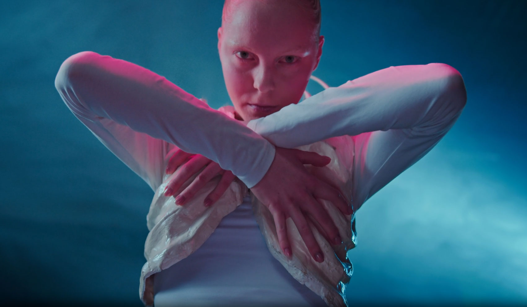
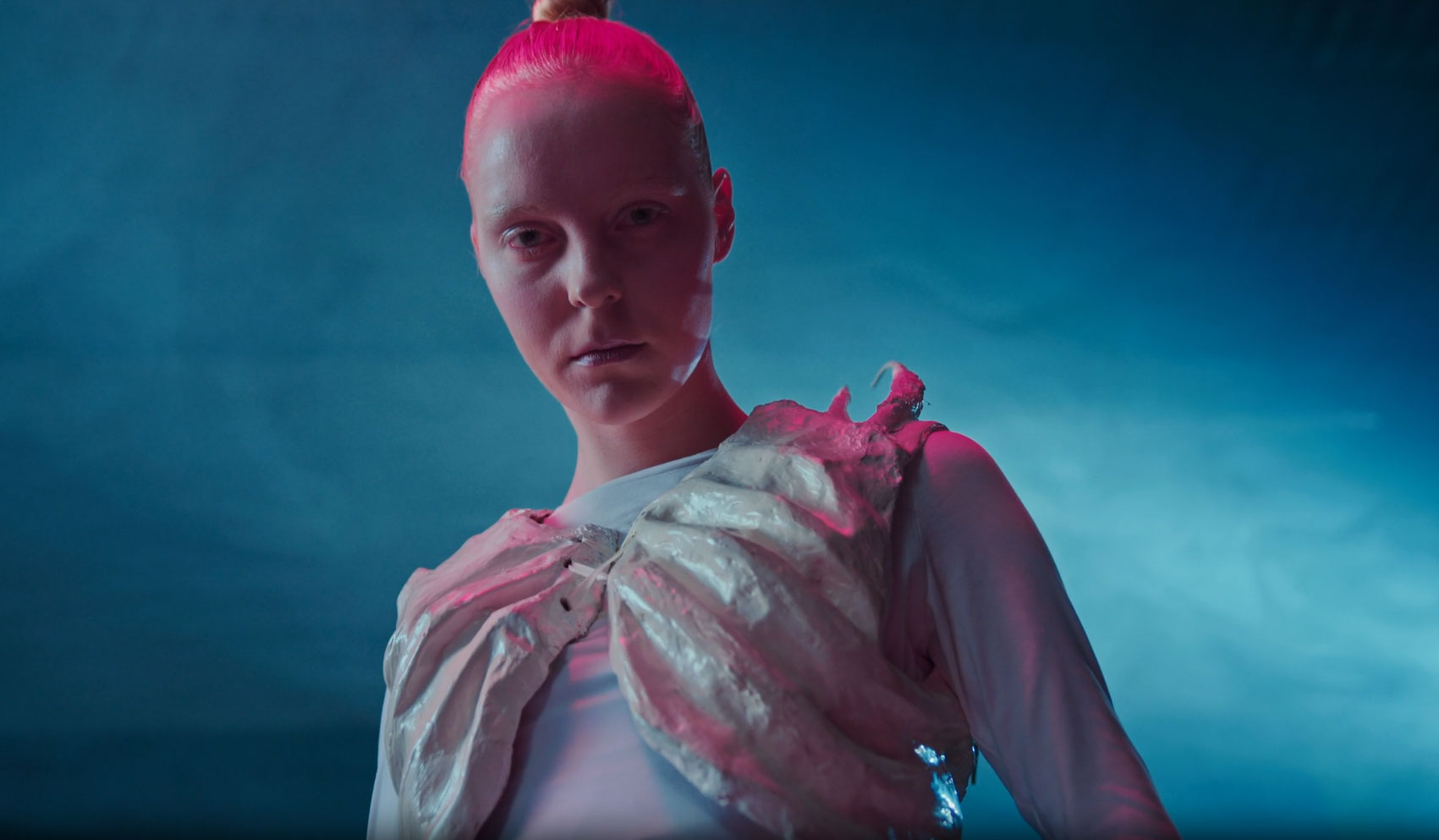
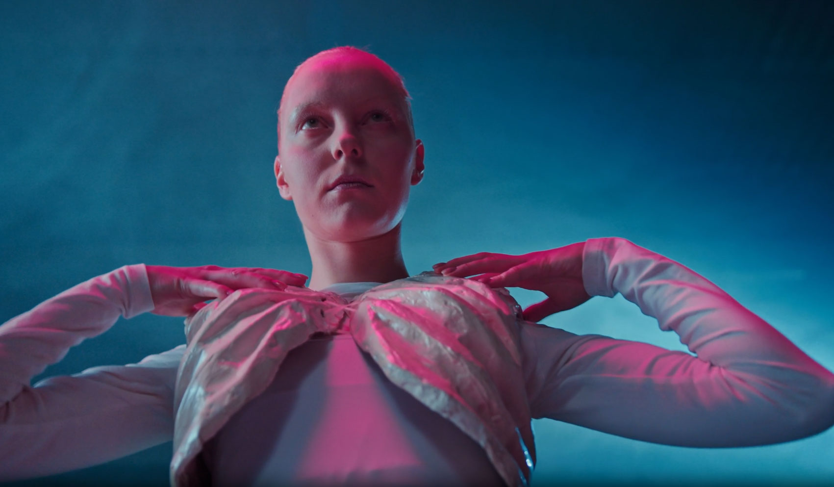
Thorned needed a presence as unsettling as the object itself. Not dark for the sake of it, not fashion in the usual sense. A brand for people who wear things that ask questions before they answer them.
Art direction focused on the body as architecture. Light as the only set. Blue and rose fighting for the same surface. Every frame built to hold the tension without resolving it. Nothing explained, nothing softened.